


Define the problem
There are main two types of personal trainers: corporate trainers and independent personal trainers. Corporate trainers work for a gym (Gold's, Crunch, etc.) and don't have to prospect for their own clients. The gym provides them with a steady flow of clients, in return for an average of 70% of the hourly booking rate. Independent personal trainers, on the other hand, work out of studio gyms, which they pay for themselves, or at your house, a park, etc. Their rates are often a bit lower than corporate rates, but they get to keep the full rate.
The Team: Product Manager/Designer (me), CEO/Software Engineer
The Challenge: The challenge becomes prospecting for clients. Independent personal trainers often don't know where to begin. They also struggle with the logistical elements of personal training -- processing payments, bookings, etc.
Our Solution: fitbookr aimed at helping personal trainers with all of the logistical elements of working with clients, including marketing, booking and payments, so they could focus on what they do best: training.
Initial User Research: To test market demand for our product and to understand what features should be included in our MVP, we set up interviews on the supply and demand side, with both independent personal trainers and users in the SF area who were interested in or seeking a personal trainer. On the supply side we asked about trainers' customer acquisition process. Most trainers were not engaging in any marketing or business development. On the demand side, we asked users how they approached and began a search for a trainer, what they wanted out of their trainer, and what obstacles had prevented them from seeing a trainer in the past.
We ultimately found that people did not know how to find a personal trainer outside of the gym system. On the trainers’ side, we found that trainers didn't know how to market themselves, and few trainers had created a website or set up social media.
Design Inspirations: Based on feedback we had from early user tests, we found that there was often a lot of friction related to seeing a personal trainer. People who were on the fence about seeing a personal trainer wanted complete visibility into the trainer's schedule, and didn't want a lot of back and forth. Thus, we wanted a really easy scheduling flow and a very clean, easy to understand profile. We looked at a number of sites for inspiration (e.g., Facebook, Zocdoc, Google calendar).

Discovery
After we came up with the primary information that potential users needed to see in order to make a decision on whether they would book a personal trainer, we had users rank how important each piece of information was for them. I then sat down with the CEO and we categorized each piece of information into "sections." We next came up with a basic hierarchy of how we wanted the page to work.
Ultimately, we wanted to drive bookings for the trainers, so we spent a lot of time around simplifying the sign-up, scheduling, and checkout process for new users.

Design
Profile page: We came up with multiple versions of the profile page. The primary problem that we had was how to structure the layers of information about the trainer. What were the main pieces of information that we needed to display to potential clients? We tested our prototypes with users, and settled on displaying photo, contact, and specialization info above the fold. The secondary focus was on logistics: place & time. The third focus was on additional photo content and a Twitter/Instagram feed at the bottom of the page.
The second main challenge was in terms of scheduling. Scheduling on mobile was a large problem. What was the appropriate scope to show to a potential client? We tested day-by-day and week-by-week. We ended up displaying a full week-long read-only view that users could click into to open up a new scheduling page. This allows users to get a quick view of availability while they are browsing trainers and then get a more detailed, close-up view when they are actively interested in booking.
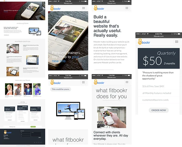
Splash page: I created several sets of wires for the splash page and the profile pages. I did the wires in Balsamiq and exported a clickable prototype. We did some quick usability testing on the prototypes and altered our layouts to improve confusing parts of the splash page flow.
We needed a design that was responsive enough to work across both web and mobile. The primary objective was to get people to try the product. Thus, the primary call to action leads people to a very simple sign-up flow that gets them building their site quickly.
Deliver
Given that our concept was meant to allow for ease of use and flexibility, we focused on making sure the site looked intuitive and beautiful on mobile. On our splash page, the long-scroll worked well; based on our tracking, 75% of visitors scrolled all the way down to the pricing. For the profile pages, we focused on simplicity, and driving bookings.